


THE ESSENCE OF JAPANDI COLOR
Where Scandinavian simplicity meets Japanese serenity — color becomes more than design.
It becomes a tool for calm.
-
Photo + Design @skin.interior

MEDITATIVE NEUTRALS
The Japandi color palette is a meditation in itself.
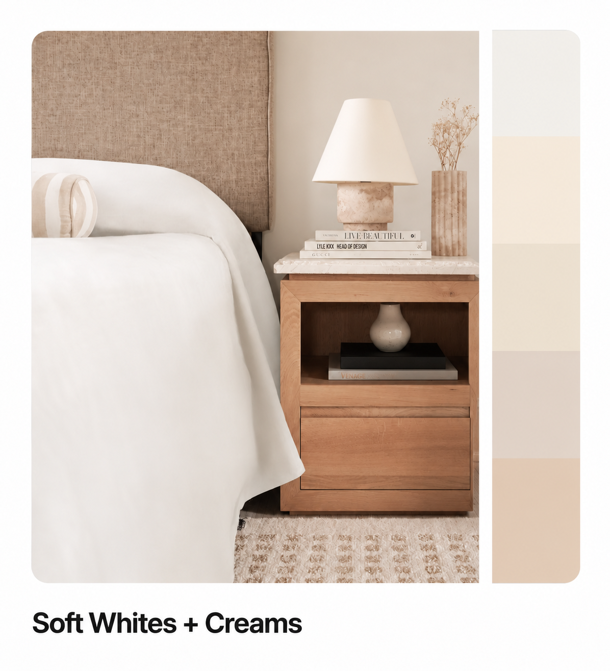
Soft whites, muted taupes, earthy greys, warm beiges, and gentle charcoal tones drawn from nature’s quiet moments — mist over mountains, sand against stone, sunlight filtered through shoji paper.
Together, they form a visual language of calm that transcends trends and borders.

A color palette is the foundation of visual harmony — the collection of hues, tones, and shades that create the emotional rhythm of a room. In Japandi interiors, that rhythm is slower, intentional, and deeply tied to natural balance.
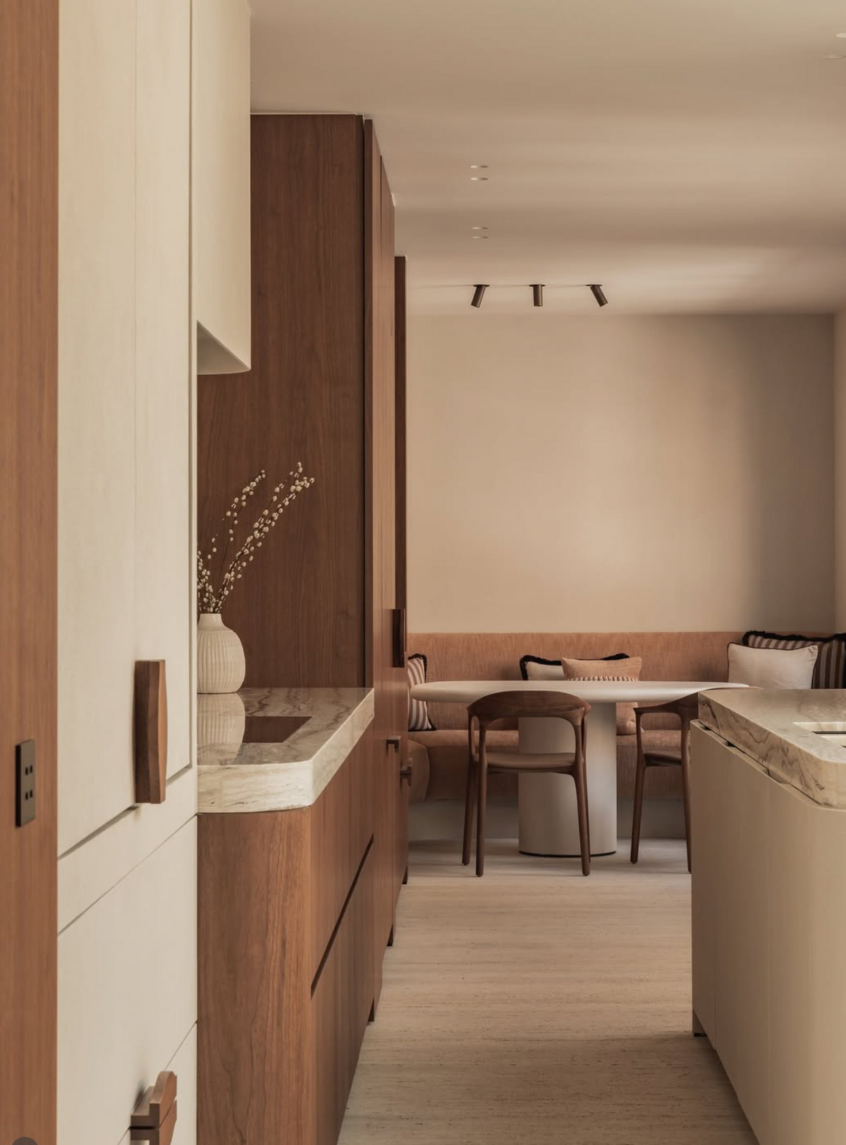
Rather than a rush of color, you’ll find a quiet layering of neutrals and natural materials, creating depth through light, shadow, and texture.
Explore calm, balanced design — where interiors from around the world show how color becomes a living, breathing part of daily life.
Design / @lc_interiordesigner
The origins of the Japandi color story come from two philosophies united by restraint and respect for nature:

Japanese wabi-sabi
Honors imperfection and transience — colors here are aged, grounded, and weathered by time.

Scandinavian hygge
Embraces light and warmth — tones that invite, soften, and hold space for wellbeing.
Design @skin.interior
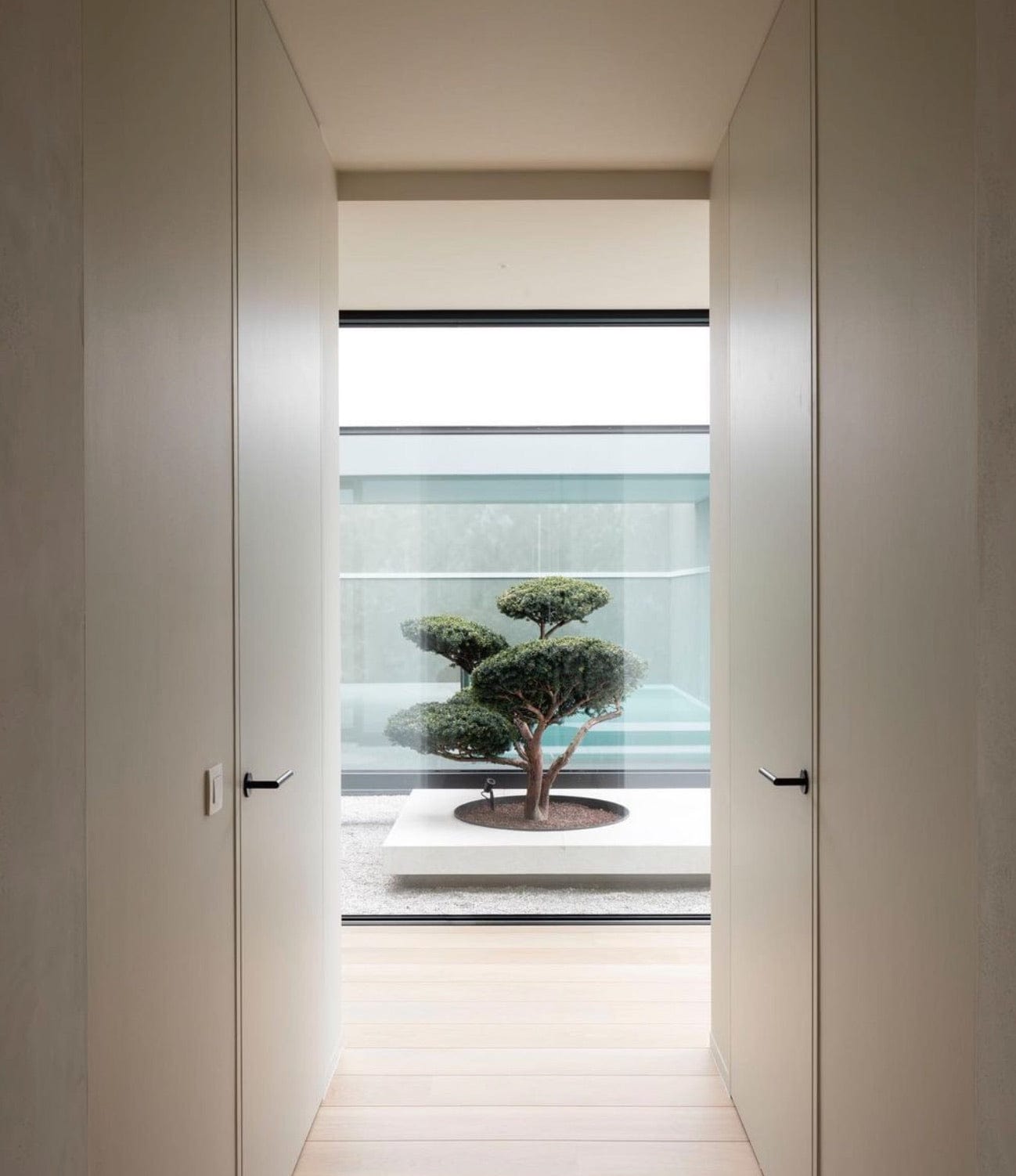
Japandi
Design @lc_interiordesigner



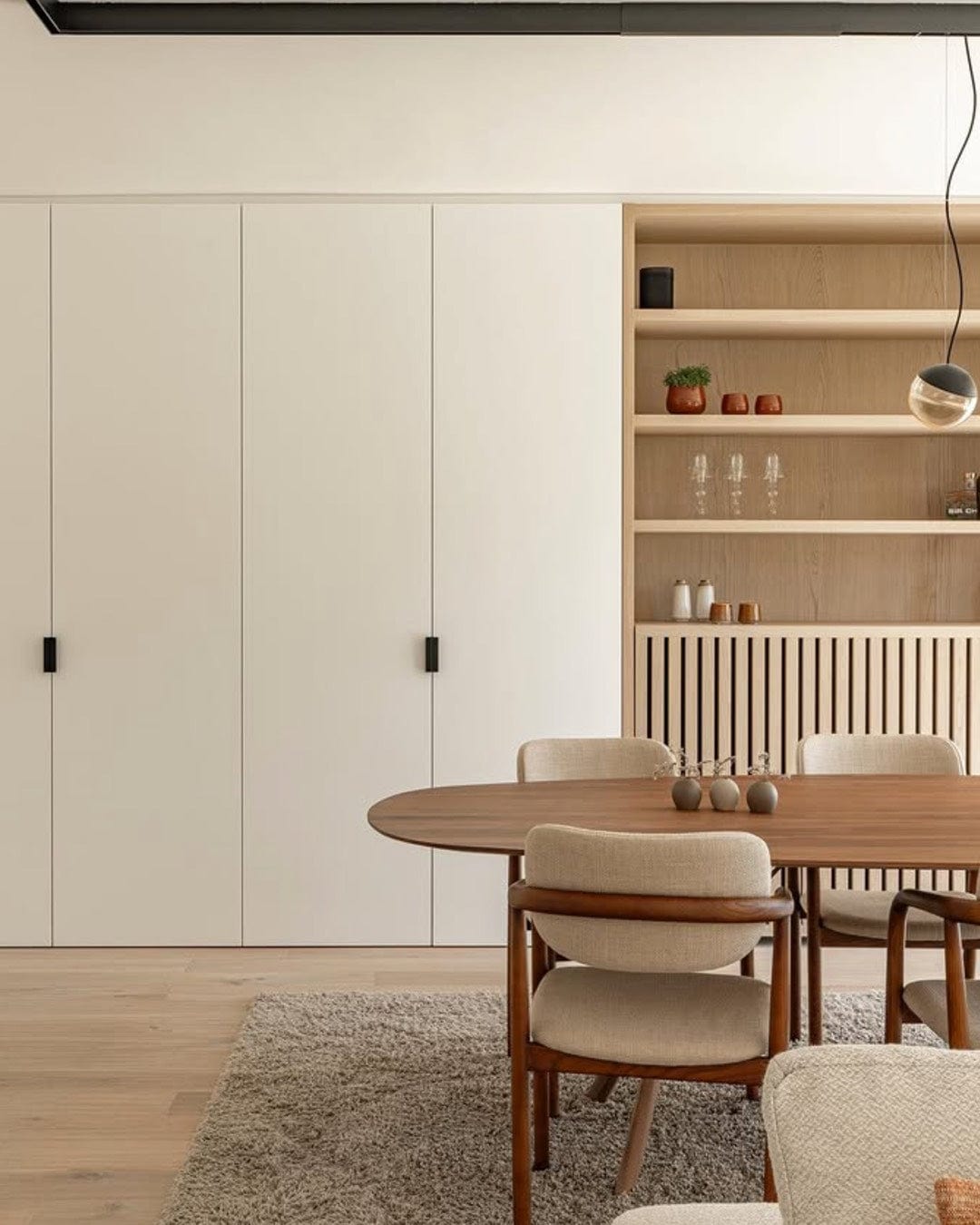
Meaning your brain doesn’t have to process visual clutter.
The result?
Lower stress, steadier focus, and emotional rest.
Design / @skin.interior
JAPANDI COLOR PALETTE
Creating Balance Through Tone.
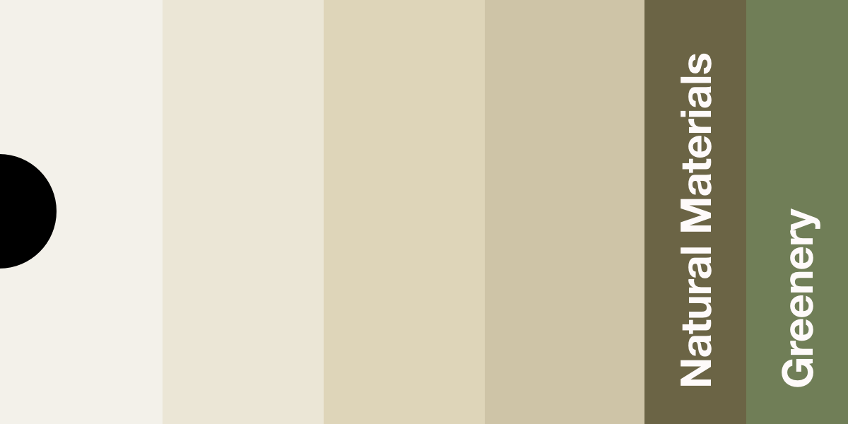
Warm Neutrals — Comfort and Connection
Warm neutrals are the heart of Japandi interiors, creating a sense of welcome and familiarity. These tones draw from the natural warmth of earth and sunlight — colors that make a room feel grounded, intimate, and human.
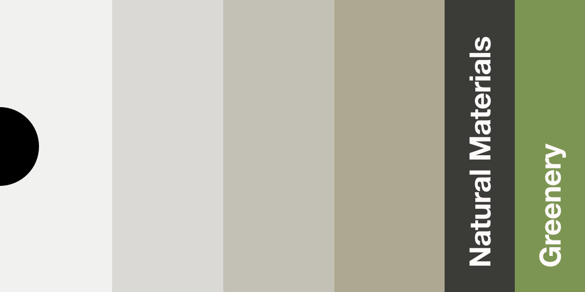
Cool Neutrals — Clarity and Calm
Cool neutrals evoke tranquility and reflection — they mirror the stillness of stone, water, and shadow. These tones balance warmth by offering visual rest, especially in sunlit spaces or minimalist environments.
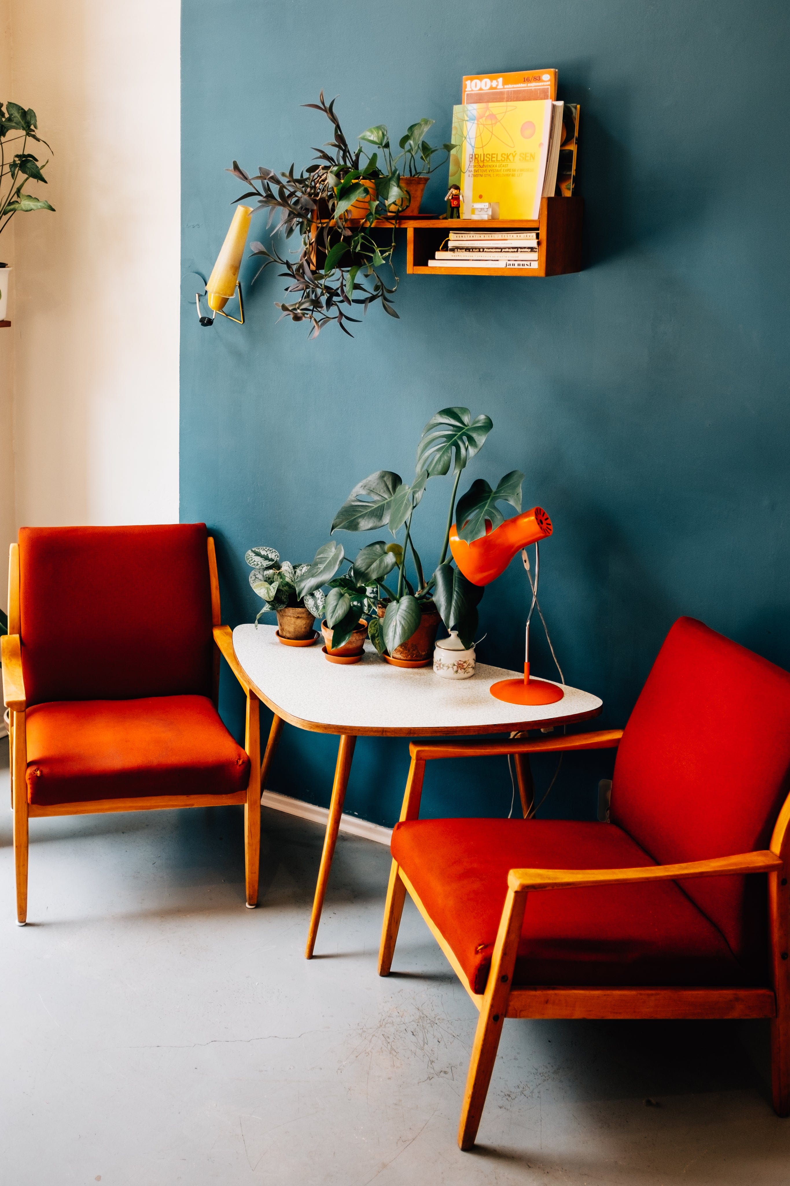

@lc_interiordesigner
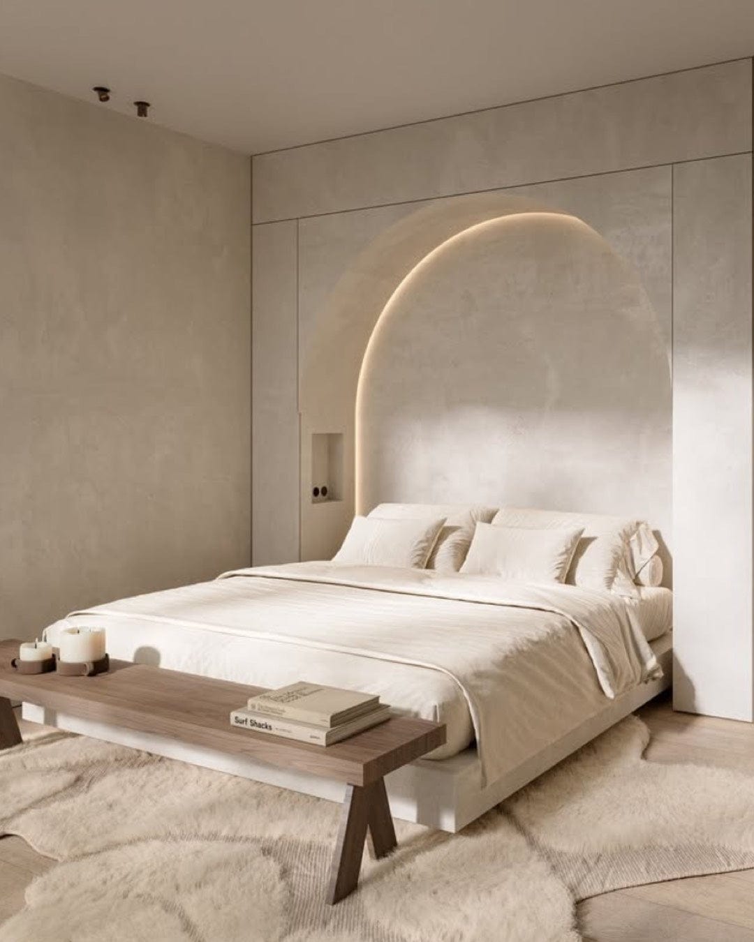
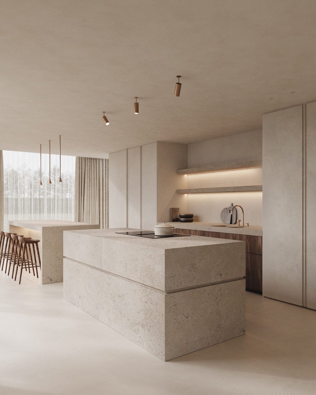
In many ways, the Japandi palette is a visual form of meditation — offering the same stillness we crave in our daily lives.
Design / @lc_interiordesigner
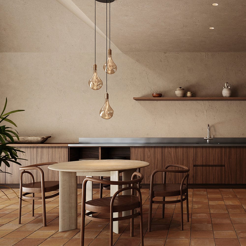
Neutrals shine when thoughtfully balanced.
Without variety, they risk feeling flat — but with the right textures, finishes, and layers, they become dimensional and alive.
Stunning Image / Tala Lighting
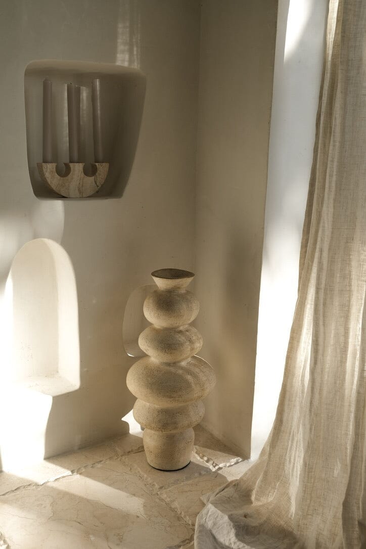
Layer Textures
Mix smooth ceramics with woven fibers, matte walls with polished wood.
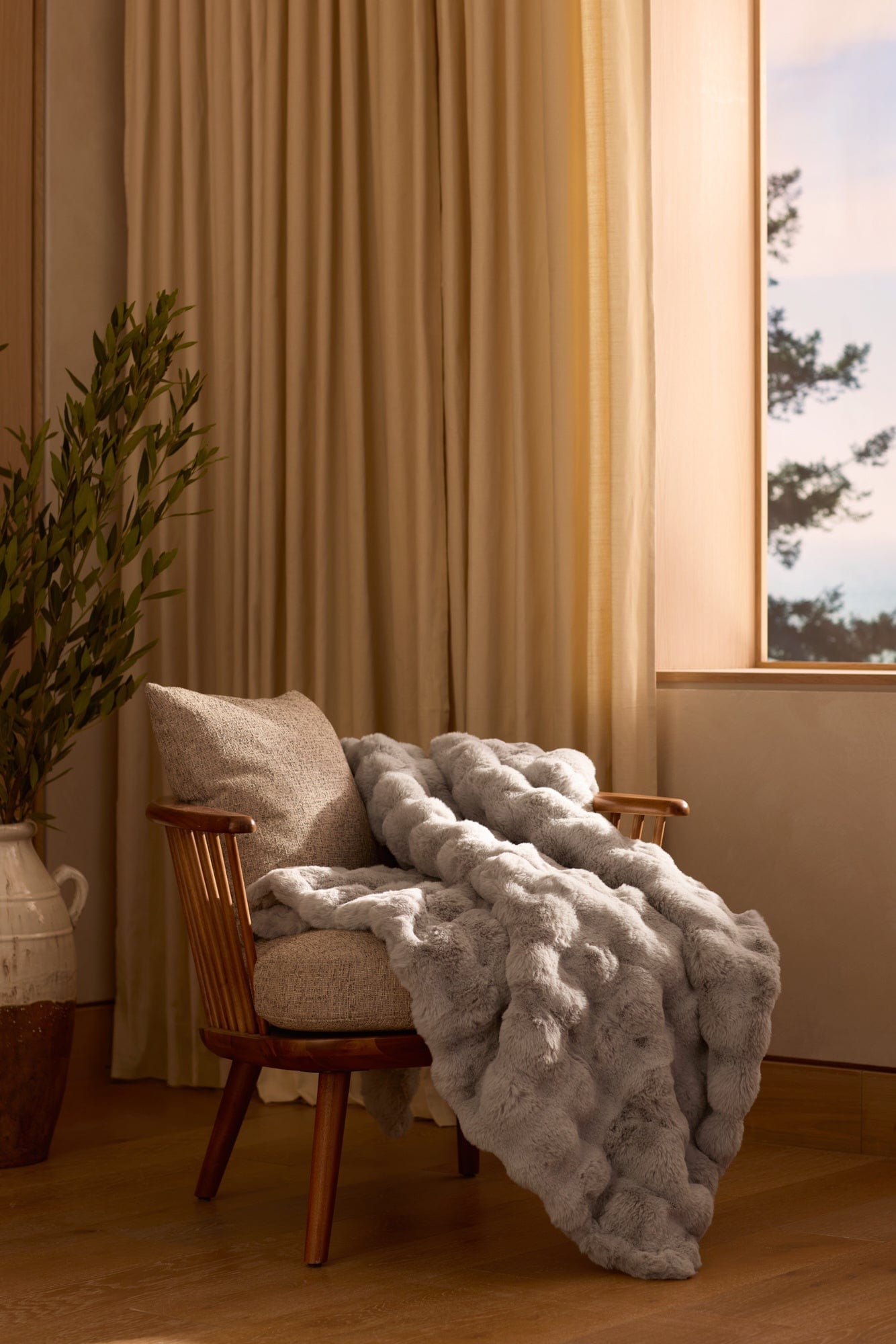

Invite natural light
Let sunlight reveal tonal shifts throughout the day.
Ground the palette
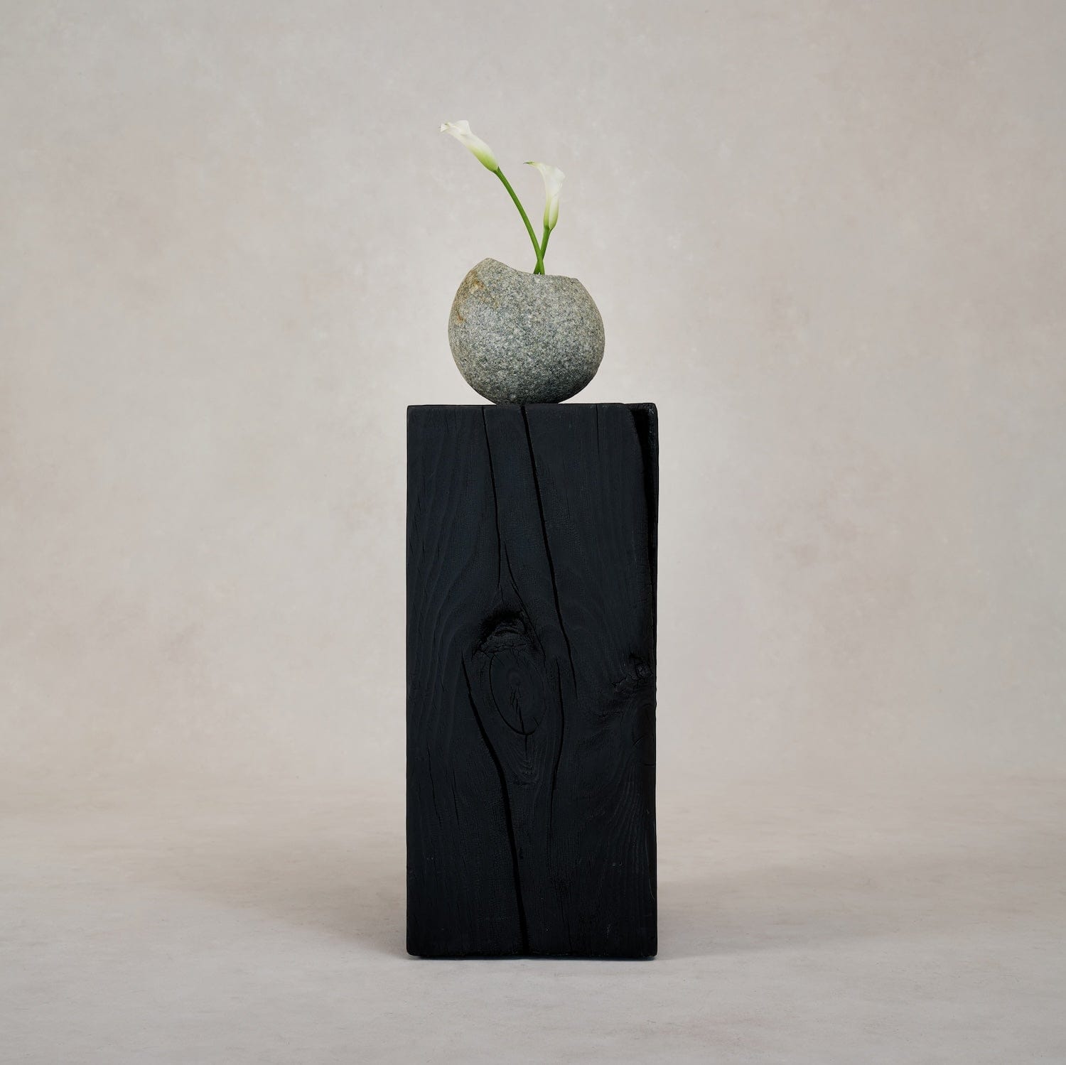
Add a darker anchor (like walnut or charcoal) for structure.
Add organic warmth
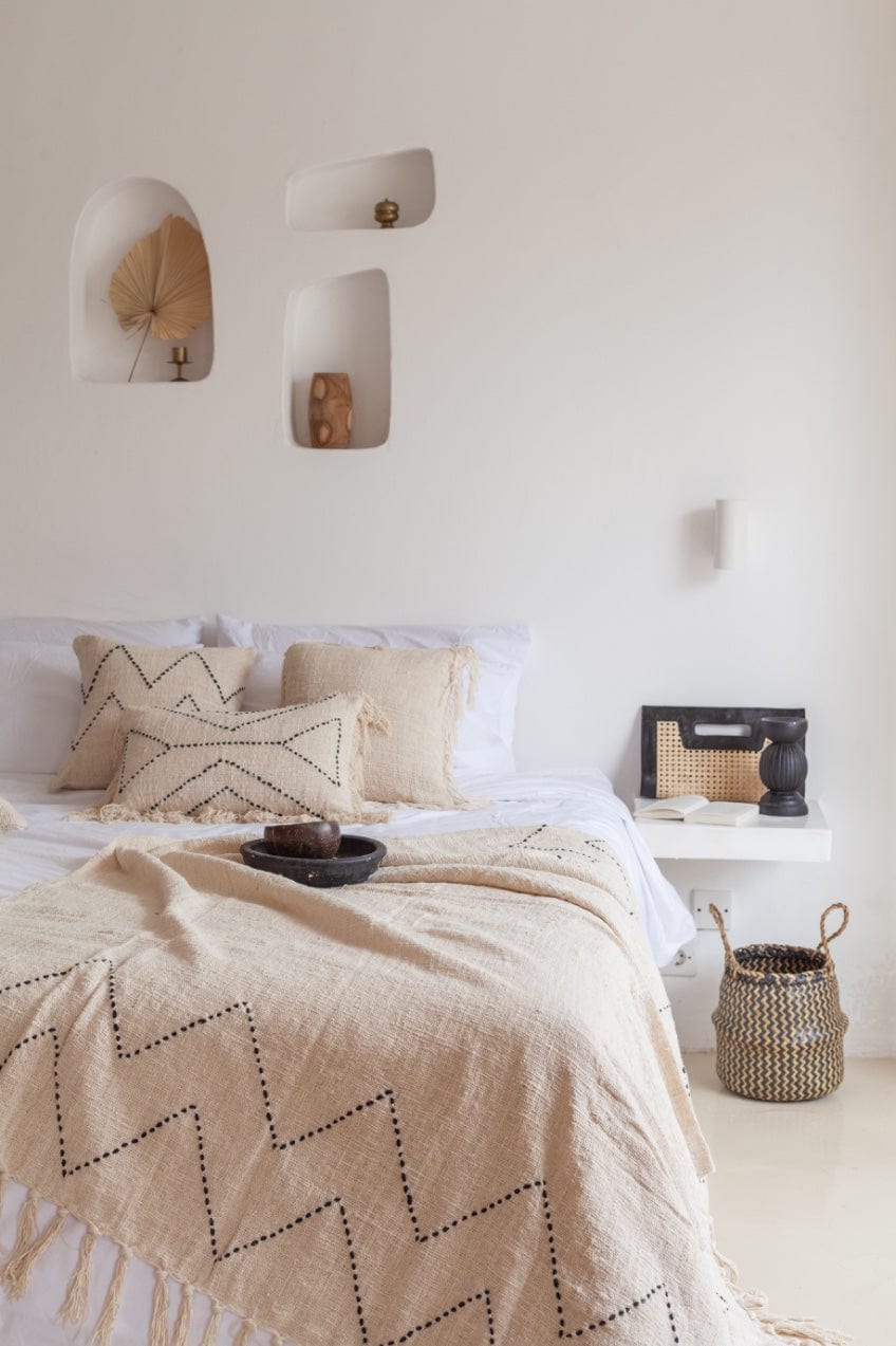
A linen throw, a clay vessel, a handcrafted stool — these bring the human touch.
Incorporate living elements
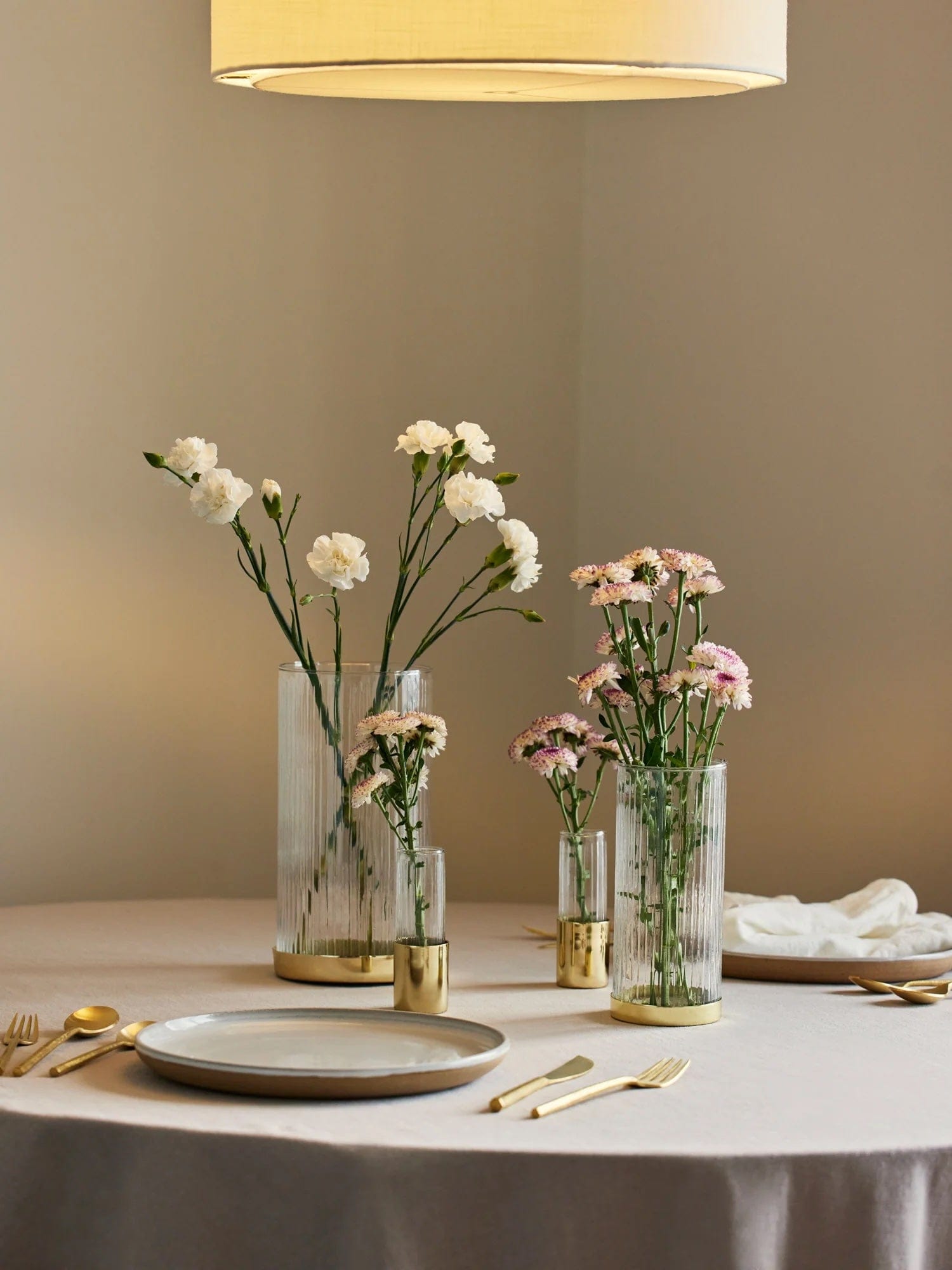
Plants, branches, or even a simple bowl of fruit introduce subtle color shifts that keep a neutral space feeling alive.
Designers featured in our Japandi Design Gallery — from Scandinavian studios to Japanese architects — show that restraint is not limitation. It’s freedom.
Freedom from overstimulation. Freedom from noise. Freedom to simply be.
Through their work, we see how color, material, and light become tools for mental clarity and emotional restoration.
Design / @skin.interior
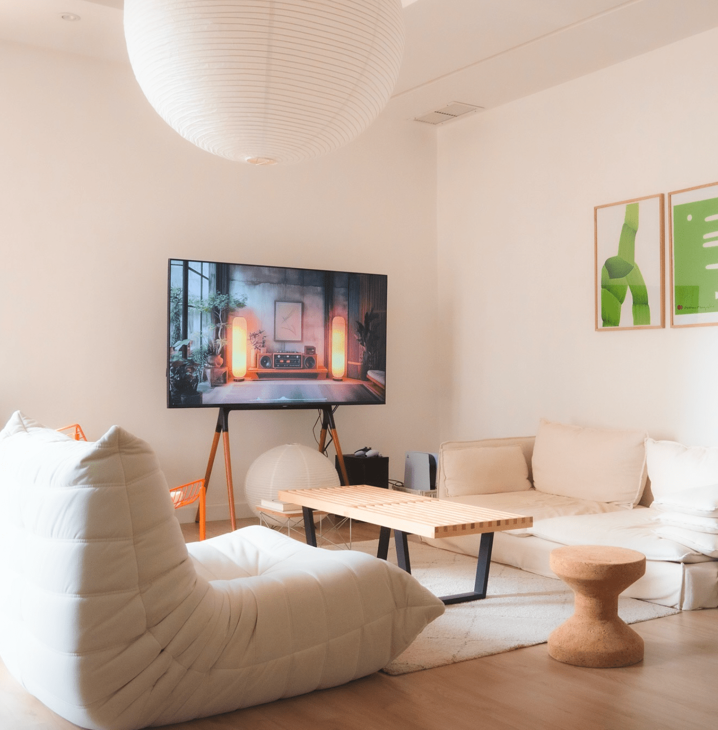
See how designers interpret the Japandi color palette — from Kyoto apartments to Copenhagen studios and beyond. Each project shows how calm, color, and craftsmanship come together in harmony.
